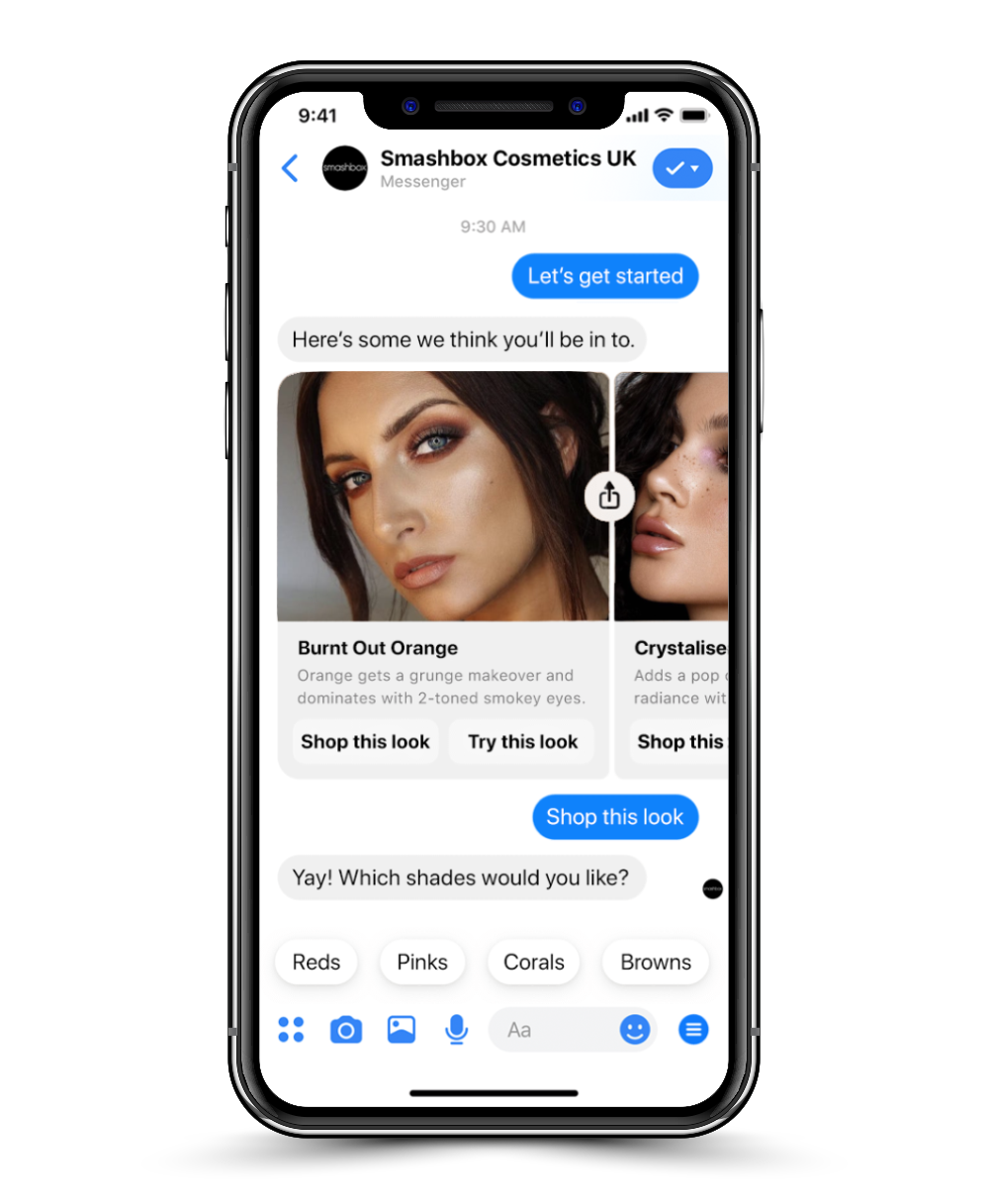
Smashbot
Strategy, copy and interaction design for Smashbox’s Facebook Messenger chatbot
The Work
Landscape analysis, Audience research, Content audit, Content taxonomy, Information architecture, UX & interaction design, Brand TOV review, Chatbot copy & imagery
The Project
Build the UK’s first beauty chatbot. Estée Lauder wanted to digitally engage the young, connected audience of its Smashbox Cosmetics brand. A chatbot was proposed for users to find style inspiration, use AR to try on makeup and shop the entire range, all within Facebook Messenger.
The Approach
Give the bot a Smashbox personality. I undertook a comprehensive review of Smashbox’s tone, style, values and content output. I combined this with an audience and landscape analysis, allowing me to produce copy & imagery (incl. emoji and GIFs) for the bot that delighted users and resonated with the brand. I implemented this alongside an information architecture that, incorporating UX & interaction design, condensed the entire website’s functionality into an intuitive and fun experience.
The Result
“The most innovative chatbot yet.” Smashbot generated over 10,000 interactions in its first month, and was covered in The Drum, Cosmetics Business and Stylist, the latter praising it as “unique”, “a game-changer” and “the most innovative chatbot yet”.
Ava Welsing-Kitcher
I assumed it would be just like any other chatbot — but I was definitely surprised at how much personality it had. It replied just as a millennial girl would.
Junior Beauty Writer / The Stylist / Read full article


